Subscribe to:
Post Comments (Atom)
skip to main |
skip to sidebar

Look at this when you read serious posts.

Look at this when you read humorous posts.


"As a freethinker and an old-style atheist, he had a need to discourse from time to time on lofty matters." (from The Village of Stepanchikovo by Fyodor Dostoyevsky)
Look at this when you read serious posts.
Look at this when you read humorous posts.
Blog Archive
-
▼
2007
(292)
-
▼
July
(37)
- Here and There
- Unpleasant Business
- Around the World Wide Web 17
- Conflict
- Sick Humor
- A Bad Day
- Understanding the American Left's Foreign Policy
- A Few Notes
- Around the World Wide Web 16
- Forums
- Around the World Wide Web 15
- Hard Time
- It Takes A Giant
- Around the World Wide Web 14
- Friday Night
- Trends
- Things I Could Never Do If I Lived To Be 1,000
- Around the World Wide Web 13
- Banned From NoodleFood
- Modern Speech
- Blog rating
- Around the World Wide Web 12
- Competition
- Housecleaning
- The Plays of Roswitha
- A Pointless Story
- The New Piety
- Remember When?
- Around the World Wide Web 11
- Be Proud, America: Don't Recycle
- The Second-Hander As CEO
- Robert Heinlein and His Antithesis
- Around the World Wide Web 10
- John Brunner
- Why Does Liberal Talk Radio Fail?
- Around the World Wide Web 9
- When Two Evils Compete
-
▼
July
(37)
- 3 Ring Binder
- A Writer's Life
- Abandon Caution
- Ablekane Adventures
- Acid-Free Paper
- Adventures In Existence
- Aesthetic Capitalist
- Alexander Marriott's Wit and Wisdom
- American Individualist
- Anger of Compassion
- Applying Philosophy to Life
- Armchair Intellectual
- Bahr's House of Exuberance
- bblog
- Better Living Thru Blogging!
- Beyond the Wall of Sleep
- Blackmarket Pies
- Born Again Redneck
- Brad Harper
- Brass In Pocket
- Capitalism Magazine
- Centauri Dreams
- Charlotte Capitalist
- ChicagoCon
- Coroner's Bureau
- Creative Life
- Crucible and Column
- Darren Cauthon
- De Hominibus
- DennisBlog
- Dirty Kuffar
- Dispatches From Area 32
- Dithyramb
- Doc MacDonald and Friends of Individual Liberty
- Dougout
- Eclectic Views From the Fringe
- Edelweiss
- Edge of Reason
- Ego
- Elle Clark
- Eran Dror
- Erosophia
- Evanescent
- Flibbertigibbet
- Forces
- Forgotten Delights
- Forum for Ayn Rand Fans
- Four Rs
- Fun With Gravity
- Galileo Blogs
- George Reisman
- Google News
- Gus Van Horn
- Haight Speech
- Hence, the Elizabethan
- Image Adjustment
- Inductive Quest
- Just Add Rationality
- Kalamazoo Objectivist
- Kapitalismus-Magazin
- Kim's Play Place
- Kindredist
- Kriegsgefahrzustand
- Leitmotif
- Literatrix
- Making Progress
- Medworth
- Mike's Eyes
- Mister Swig
- Morality War
- New Clarion
- Night Watchman
- No Warrent For Being
- NoodleFood
- Not PC
- Noumenalself
- Objective Standard
- objectivistvoice.com
- One Reality
- Peltz At Hand
- Philosopher Stone
- Philosophical Detective
- Philosophical Mortician
- Politics and Pigskins
- Politics Without God
- Powell History Recommends
- Primacy of Awesome
- Principled Perspectives
- Prodos Blog
- Quirky
- Radio Dismuke
- Ragamuffin Studies
- Rational Capitalist
- Rational Jenn
- Rational Passion
- Reasonpharm
- Ron Pisaturo's Blog
- Rule of Reason
- Secular Foxhole
- Simply Capitalism
- Software Nerd (really?)
- Spark A Synapse
- Strategikon
- The Neointellectual
- Thrutch
- Titanic Deck Chairs
- Two--Four
- University Suckers
- Valzhalla
- Witch Doctor Repellent
- wopsr.net
About Me
- Myrhaf
- Inland Empire, California, United States
- I graduated from Eisenhower High School in Rialto, California in 1975. Did four years in the USAF as a chinese linguist. Got my BA in Theatre Arts from California State College, San Bernardino. Went through the Professional Program in Screenwriting at UCLA. Have written plays for the stage and comedy for radio morning shows. Lately I've been acting a lot. I've been in shows by Shakespeare, Agatha Christie, Edmond Rostand and Maurice Maeterlinck -- not a bad run! People ask, "Why Myrhaf?" Myrhaf is a character in an historical novel I'm writing called Viking Blood. He is a mentor figure who dies in the first chapter. I thought the name would give my blog some style, some flair and a title readers would remember. My real name is William Greeley. Although I am an Objectivist and often write about the philosophy on this blog, I do not speak for anyone but myself. I would urge those who want to learn about Objectivism to read Ayn Rand's novels and nonfiction books and then Leonard Peikoff's Objectivism: The Philosophy of Ayn Rand.
Some Of My Favorite Posts
- What Will Follow?
- When Words Are Weapons
- Derrida on 9/11
- The Defining Premise
- Diplomacy
- Science and the State
- What Women Want
- They're Not Crazy
- The Iraq Study Group
- Der Wannabe Fuerher Speaks
- It Never Ends
- Listen to the Future
- The Future of the Left
- The Lessons of Vietnam
- The Seen and the Unseen
- Blues and Greens
- Talk Radio Hosts
- Republican Water Boy
- Living the Revolution
- The Conservative Cocoon
- Be Proud, America: Don't Recycle
- Why Does Liberal Talk Radio Fail?
- The Missing Virtue
- Grover Cleveland
- Gerald Ford, RIP
- The Worst American President In History
- The Big Picture
- Only Egalitarian Racist Speech Allowed
- George W. Bush
- Hopelessly Befuddled
- Liberaltarianism
- Better Or Worse?
- The New World Order
- The Towers of Ilium
- The Principle of Darkness
- Ironic Provincialism
- Sherlock Holmes
- Finding Objectivism
- The Sublime Art
- Ego Hugo
- Movies New and Old
- Poetry, Song Lyrics and Free Verse
- A Child's Art
- On Fantasy
- Entry Level Science Fiction
- Old School and New School
- The Art of Acting
- The Art of Acting: Recent Thoughts
- Rules For Actors
- Notes On Acting
- Scrambled Eggs
- Lines
- Finding the Values
- Actors Are Not Dogs
- The Decline of Popular Music
- The Lubitsch Touch
- 300
- Two for Plot Writers
- Conflict
- Thoughts on the Mystery of Shakespeare
- The Death of Science Fiction
- The Plays of Roswitha
- Tunesmith
- Lunatics and Idiots
- Super Old Age
- Breaking Up
- Demon Alcohol
- Where Are They?
- Eight Items About Uranus
- My 10 Favorite Comic Artists
- Top 10 Lamest Members of the Legion of Super-Heroes
- Jimmy Carter Negotiates Peace In Van Halen
Poetry
Followers
Cluster Map
Flags
political spectrum
My Political Views
I am a far-right social libertarian
Right: 9.96, Libertarian: 8.02
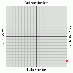
Political Spectrum Quiz
I am a far-right social libertarian
Right: 9.96, Libertarian: 8.02
Political Spectrum Quiz
19 comments:
Nice! I'd perhaps take the text off your portrait.
Actually, it might achieve more balance for the look you are trying to get for you to move the portrait to the top of your left column, have your name/blog title on the left side of the header, and the quotation in the main body of the header.
Or not.
Blogger only gives two options on the picture: under the title or in place of the title.
Yellow?
Kind of bright.
How's the gray?
Keep the portrait. You look like the kind of guy who's just obnoxious enough to get along swimmingly with me. (My portrait should bear that out on your side as well.)
The only thing I worry about with that pic is that I look like I'm having too much fun. This might incline readers not to take my serious posts seriously.
Much better. Some blog color schemes are too bright and are hard on the eyes.
Thanks for your opinions, all.
I like it. You know a lot more about computers than I do. But I'm learning, however slowly.
Looks good. Nice face. Thanks for the link.
Patrick, thanks. Mike N., I doubt that I know more about computers than you. I lost my site meter link and my blog map when I hit customize. After that it's just a matter of experimenting with fonts and colors when you click layout on the dashboard.
This is much better -- well, except for the fact that you just HAD to include your "after" (a year of blogging) shot.
Myrhaf, thanks for the link!
I like your new format, except for picture of the naked fat guy. Good thing I skipped breakfast this morning. :P
How long can I keep that picture up before I start losing readers?
Sorry, Myrhaf, but the title is virtually unreadable right now -- too little contrast between the maroon and blue.
If you want to customize colours, http://www.colourlovers.com/ is an excellent resource. You can get lost in it for hours, if you have the time.
How does the gray title work?
Awesome!!!!!
How long can I keep that picture up before I start losing readers?
Myrhaf,
The better question is: Why would you want to? ;)
To be honest, I like that picture less every time I see it. Once you laugh at a joke, it is old. I'll take it down soon
Post a Comment